> For the complete documentation index, see [llms.txt](https://docs.trada.io/llms.txt). Markdown versions of documentation pages are available by appending `.md` to page URLs; this page is available as [Markdown](https://docs.trada.io/reports-and-analytics/time-tab.md).
# Time tab
Performance broken down by time of day, trading session, and day of week.
The Time tab is one of the four tabs on the Report page. It groups your auto-synced trades by when they happened — calendar day, hour of day, 6-hour session, and weekday — and shows how P\&L is distributed across those time buckets.
{% hint style="info" %}
The Time tab is a paid feature. On the Free plan the tab shows a short preview and then a blurred overlay with an upgrade prompt. See [Plans & billing](/plans-and-billing/plans-billing.md) for what each plan includes.
{% endhint %}
All times are **UTC**. The four charts read from the same filtered dataset as the rest of the Report page, so any change to the filter banner recalculates every chart at once. See [Filters](/reports-and-analytics/filters.md) for the shared controls.
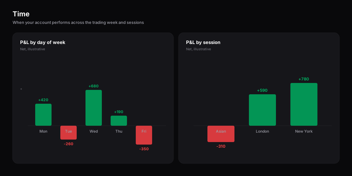
The Time tab — performance by day of week and by trading session.
## Read the day-performance overview
The **Day Performance** chart is a semi-donut (180-degree arc) with three segments — **Worst Day** (red), **Avg Day** (gray), and **Best Day** (green). Each segment is sized by the absolute magnitude of its value, and the legend below the chart lists all three.
Hover (desktop) or tap (mobile) a segment for its detail:
| Segment | Tooltip shows |
| ------------- | ------------------------------------- |
| **Worst Day** | Worst day P\&L + worst hour |
| **Avg Day** | Avg day P\&L + number of trading days |
| **Best Day** | Best day P\&L + best hour |
* **Best Day / Worst Day** — the highest and lowest single-day P\&L totals across the filtered period. A day's P\&L is the sum of all trades closed on that UTC calendar day.
* **Avg Day** — total P\&L divided by the count of unique UTC days that had at least one trade.
* **Best Hour / Worst Hour** — the highest and lowest hour-of-day P\&L, summed across every day in the period (0–23 UTC).
## Compare trading sessions
The **Session Performance** chart splits the 24-hour UTC clock into four 6-hour blocks and plots one bar per session. Bars are green when the session's total P\&L is at or above zero and red when it is below, measured against a reference line at zero.
| Session | UTC hours |
| ------- | ----------- |
| Asian | 00:00–05:59 |
| London | 06:00–11:59 |
| NY | 12:00–17:59 |
| Overlap | 18:00–23:59 |
Each trade is assigned to a session by the UTC hour of its timestamp. All four bars always appear; a session with no trades in the filtered range shows a bar at zero. The tooltip breaks the session down into five fields:
* **Total P\&L** — sum of trade P\&L in the session
* **P\&L %** — total P\&L over average account balance, times 100
* **Avg P\&L** — total P\&L divided by trade count
* **Win Rate** — trades with P\&L above zero, as a share of all trades in the session
* **Trades** — wins / losses / total (for example, `8W / 5L / 13T`)
## Break performance down by weekday
The **Profit by Day of Week** chart is a horizontal bar chart, one bar per weekday (Sunday through Saturday), grouped by the UTC day of each trade. Bars are green at or above zero and red below, against a reference line at zero. All seven bars always render; a weekday with no trades shows a bar at zero and a tooltip reading `0 trades`.
## Correlate duration with P\&L
The **Duration vs Profit** chart is a scatter plot. Each point is one trade: the X-axis is trade duration in minutes and the Y-axis is the trade's P\&L in the selected display mode. Points are split into two series — **Buy** (green) and **Sell** (red) — shown in the legend.
* The X-axis scales automatically to the data; there is no maximum duration cap, so a long hold extends the axis to fit.
* Zero-duration trades plot at `x=0`. Negative durations (a data artefact) are capped to `x=0`.
* A point's tooltip shows symbol, P\&L, duration, and side — plus P\&L % when the chart is in percent mode.
## Switch display modes
Each of the four charts has its own **display mode** selector: **USD**, **% P\&L**, and **Count**. The selectors are independent per chart, single-select, and reset to **USD** when you leave and re-enter the tab — they are not saved.
| Mode | What the chart measures |
| ---------- | ----------------------------------------------- |
| **USD** | Signed P\&L in US dollars |
| **% P\&L** | P\&L as a percentage of average account balance |
| **Count** | Whole number of trades, no decimals |
{% hint style="info" %}
Percent modes divide by an account-balance snapshot. When a trade has no balance recorded, Trada falls back to the average balance of trades that do; if none do, it uses a default of 100,000. Figures shown as percentages are approximate for that reason. See [Formulas](/reference/formulas.md) for the exact definitions.
{% endhint %}
## Handle empty and edge cases
* **No trades match your filters** — all four charts hide and the tab shows the empty-state message. The display-mode selectors stay visible but disabled.
* **Trades in one bucket only** — the other buckets still render at zero rather than disappearing (all four session bars, all seven weekday bars).
* **A single trade** — each chart renders its one data point: one donut segment, one session bar, one weekday bar, one scatter point.
* **No loading spinner** — when filters change, values update in place and the charts animate to the new figures; there is no skeleton or spinner.
The Time tab is a read-only view of trades that are auto-synced from your connected accounts. There is no manual trade entry or editing here — to change what feeds these charts, connect or manage accounts and adjust the filter banner.
## Related
* [Report overview](/reports-and-analytics/reports.md)
* [Performance tab](/reports-and-analytics/performance-tab.md)
* [Filters](/reports-and-analytics/filters.md)
* [Formulas](/reference/formulas.md)
---
# Agent Instructions
This documentation is published with GitBook. GitBook is the documentation platform designed so that both humans and AI agents can read, navigate, and reason over technical content effectively. Learn more at gitbook.com.
## Querying This Documentation
If you need additional information that is not directly available in this page, you can query the documentation dynamically by asking a question.
Perform an HTTP GET request on the current page URL with the `ask` query parameter, and the optional `goal` query parameter:
```
GET https://docs.trada.io/reports-and-analytics/time-tab.md?ask=&goal=
```
`ask` is the immediate question: it should be specific, self-contained, and written in natural language.
`goal` is optional and describes the broader end goal you are ultimately trying to accomplish on behalf of the user. GitBook uses it to tailor the answer towards what is most useful for that goal.
The response will contain a direct answer to the question and relevant excerpts and sources from the documentation.
Use this mechanism when the answer is not explicitly present in the current page, you need clarification or additional context, or you want to retrieve related documentation sections.